Questions from the assignment
- how do you make things/Design shift right?
A note from Genspace
This is a much belated THANK YOU from all of us at Genspace to you and your whole class for their awesome work last semester. We are still processing a lot of the ideas that they raised and will certainly be in touch. It was fantastic to hear all of their different concepts, both for our branding as well as our website layout, and was a really helpful way to kickstart our redesign. Thank you so much for the opportunity and for being so great to work with, it was truly a pleasure to get to follow along with them throughout the semester.
They also have an (unpaid) internship opportunity available for current students. Know anyone who might be interested?
Resume: Review
- Amina Cheng :: Coding | Design
- Kyle An :: Coding | Design
- Grace Oh :: Coding | Design
- Lihua Jin :: Coding | Design
- Alyssa Tornese :: Coding | Design
- Ifah Pantitanonta :: Coding | Design
- Yoli Roman :: Coding | Design
Responsive Design: Introduction
- Responsive web design is making one design that scales automatically to the available width of the device
- On desktop, you can tell if a site is responsive simply by changing the size of the window and seeing whether the design "responds"
- Examples of responsive sites: bostonglobe.com, latimes.com, sva.edu, SVA MFA Fine Arts
- Examples of sites that are not responsive: Amazon.com
- Often times, when starting with an existing desktop design, "designing for responsive" involves thinking about how a relatively complex desktop layout can be reduced to one column, without removing any information.
- A "mobile first" approach to responsive design is the opposite and is more appropriate for situations where there is not an existing layout. When you design mobile first, you start with a one column design and then, once satisfied with that, add additional columns for different views on devices.
Responsive Design: How To
- Introducing Media Queries!
- Think of media queries as section dividers in your CSS—they allow for different CSS to be applied to different devices
- Look at this Liveweave sketch for example (make sure to make it full screen and change the browser width)
- Now make the "Hello Weaver" text change color depending on the device width just like the background color does
- Terminology: The points where the design changes significantly to accommodate for a new width are called "breakpoints". In the LiveWeave sketch there are 5 breakpoints.
- There's no accepted standard on how many breakpoints your design should have for it to be responsive. If you want to account for all the major devices, it can get crazy. Google is right in suggesting that the number of breakpoints should be based on the particular features of your design.
- As a general rule you only want to use as few breakpoints as possible. The more breakpoints, the more resources you'll need to create/test/maintain them.
Responsive Design: How Not To
- Judging by the example above, you may be thinking, "Okay, I get it. To make a site responsive I just have to divide my CSS into different parts for each device I want to support."
- No! That would be a nightmare to create and maintain. Imagine you decided to change the link color. If you pursued that strategy, you'd have to change it in 5 different places.
- The CSS strategy for creating responsive sites is to create the majority of the CSS outside of media queries. So styling that applies globally, meaning it does strictly depend on device width, should not be put in a media query.
- Only use media queries when you need to. Only use them for styling content specific to a certain device width.
Responsive Design: Tools
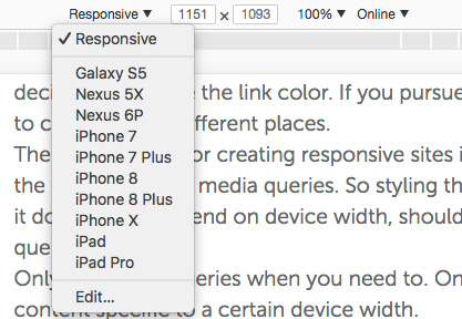
- Chrome has a built-in responsive design view: CMD + Option + i (or right click and choose Inspect Element). Then click the tablet/phone icon.
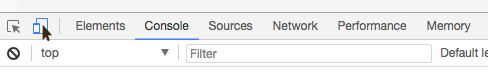
- At the top of the browser you'll notice a dropdown with common resolution settings
- If you prefer Firefox, Firebug is a very popular plugin that facilitates debugging and developing CSS in the browser. To use it, right-click anywhere on the page and then choose Inspect Element with Firebug
- I find Safari's version to be the clunkiest. First you have to enable it by going to Preferences > Advanced > Show Develop menu in the menu bar. Then you can right click as usual and Inspect Element
Responsive Design: Tips
- Responsive design makes extensive use of relative positioning to determine where elements are placed in accordance with the available width. Never use absolute positioning when working with responsive design.
- As much as possible you'll want to work with divs that take up 100% of the available width (so width:100%). This will ensure maximum compatibility with devices outside of your established breakpoints. (So if you have a breakpoint set for 320px but there's a device that's 300px wide and you've coded everything for 100% width, your design will be much better off than if you coded for 320px width. If you coded for 320px width then, on the device that's only 300px wide, there will be 20px that will be cut off.)
- As a general rule, when a multi-column design (for desktop/tablet) is collapsed to a single column (mobile), the left-most content from desktop view will be the top-most content in mobile view. So if you're designing a multi-column site for desktop, one way to prepare for responsive design is to make sure the most important content is on the left.
Responsive Design: In Class Work
- Let's start with this Liveweave sketch
- We'll add a media query for mobile and then start adding mobile specific CSS
Design 1: Improve your print resume
Deliverable: Link to online PDF
- Take the feedback from class into account and rework your resume
Design 2: Design your resume for 1 column
Deliverable: Link to online PDF
- You know that for a design to successfully work on a phone it needs to be designed as one column
- With that in mind, take your improved print resume and design it for one column.
- Important: As you design for one column try to make as few changes as possible! Try to limit your changes to positioning of elements and their typography.
Coding: Responsive Layout
Deliverable: Liveweave URL
- Convert this Liveweave sketch to a responsive design
- This design already works fine on desktop so we'll only add one media query (at the bottom of the existing CSS) to make the appropriate changes for mobile
- In that media query block, add CSS to scale the design for mobile view
- Remember: the same design needs to work both for desktop and for mobile so, using FireFox's or Chrome's Responsive Design View, keep alternating between phone view (320 x 480) and desktop view (980 x 1280)
Writing: Final project
Deliverable: Google doc
- We're going to start thinking about our final projects early
- For next week, come up with 3 different ideas for a final project, which will be a fully functioning website.
- The sky's the limit! Write a few sentences about each one.
Further Reading
- The article that started it all: Ethan Marcotte's Responsive Web Design
Cool Links
- https://bullyingandbehavior.com/
- http://tech2025.com/
- "Walkie" VR films
- Partisan Thesaurus
- The Making of Drone 100
Submitting Your Work
Due Monday, 2/4 @ 10AM
Make sure all links are publicly accessible (your grade will be lower if I cannot access your work). To make sure, open up a new private/incognito browser window and test all links before submitting. After the links have been tested, submit them to this Google Form.